Interview with Laura Varsky by Galya Mladenova
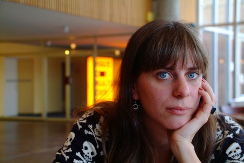
Laura Varsky is a designer and illustrator from Buenos Aires, Argentina.
Her first forays into the design world came through her involvement with the local independent rock scene. She gradually asserted herself as a designer, specializing in the design of books and CD sleeves. In 2006 she received a Latin Grammy as Art Director for “Best Record Packaging.”
In the illustration field her work has been involved in several art projects around the world as well as several professional commissions for advertising, editorial and commercial illustrated products. For more than 10 years she has taught typography at UBA (University of Buenos Aires) and this year she released her first typeface: Lady René.
What inspired you to become a designer? What was the first project you worked on?
I remember really well (something really strange in me) the exact moment when I decided to study graphic design. I was 16 and I was visiting a friend of my family who was studying graphic design at UBA. He showed me an exercise for college. It was a book about “tea”. I found it amazing, the act of analyzing something as common as an infusion, and making it a focus of study. Using its texture, its bouquet, its history, its symbolism and aesthetics to create a new way of thinking and presenting it.
My first important project was a CD cover design around 1996.
How is designing an illustration different than designing a book or a CD sleeve?
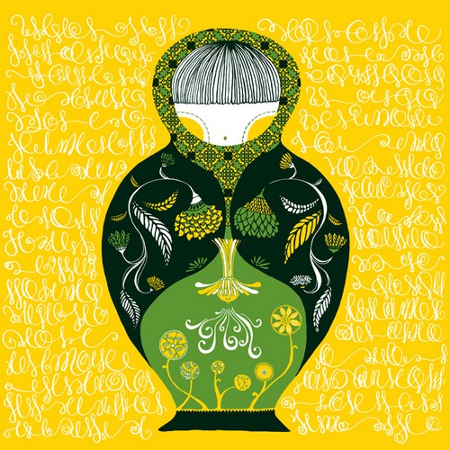
The most important difference, I think, is about how you build the graphic language. When I’m designing, I try to find the best style or aesthetics for this album in particular. How it’ll look has to do with a lot of things; especially music and concept. I discover which way to go after long conversations with musicians.
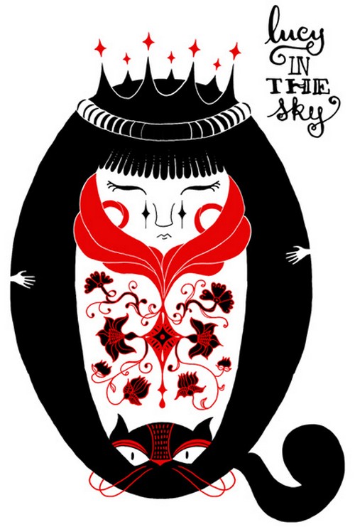
When I work as an illustrator I put my focus on developing my own style. I put my focus on my own experience, memories and tastes. I read in a comic from Sampayo: “style is the place where the soul reposes.” Well, according to this poet, I try to find where my soul is.
In both cases (designing and illustrating) the most interesting thing is that we have the opportunity to read reality, interpret it, represent it and complete it.
We see a lot of fine details in your work. Where does your passion for detail come from?
I really love art nouveau style. All the production between the 1900’s and the 1930’s: Beardsley, Mucha, Klimt, Josef Hoffmann, Margaret Mackintosh, etc. I admire Hundertwasser’s work too. I like the way in which they used the drawing line. And, of course, I love the work of William Morris and how he reached different areas with his unique style. He was an inspiration whose works have inspired me.
How is the typeface important for a product?
It’s fundamental. No doubt, one of the things that distinguish a good designer is his/her use of typography. Because, in my opinion, it is the only item or tool which is almost exclusive to design. Somehow it’s ours. I consider that “how to say something” is one of the greatest responsibilities of any graphic designer. And we must be aware of our decisions in this sense.
You have a Latin Grammy as Art Director for best record packaging. Please tell us more about the winning project and the award.
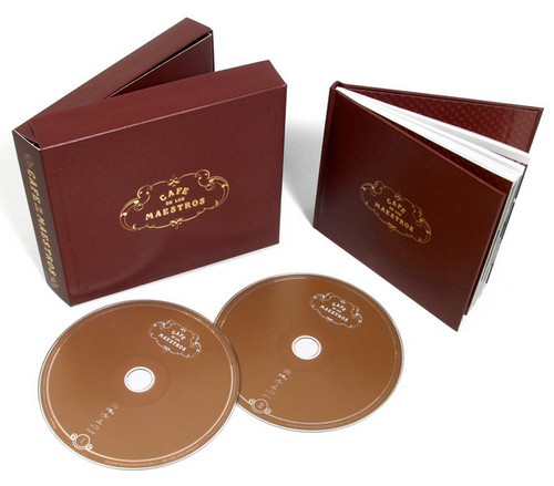
I won the Latin Grammy Award for “Café de los Maestros”, a tango music CD packaging.
“Café…” is, in itself, very interesting. This is a box that contains two discs with recordings that the producer Gustavo Santaolla made with great interpreters of tango from the Río de la Plata (artists that are between 70 and 90 years old). The project is a reassessment of the genre and its interpreter.
The complexity of the design emerged from the need to transmit, from the pack and the editorial graphic line, all layers that the project had to tell. Showing their characters, the environment and culture of tango –moving away from the tourist cliché.
The final result, I think, looks quite minimalist, but very carefully crafted and complex from its editing of contents.
The Latin Grammy Awards recognizes artistic and/or technical achievement and the winners are determined by the votes of their peers -the qualified voting members of the Latin Recording Academy.
How did you decide to make your own typeface? Why did you name it Lady René?
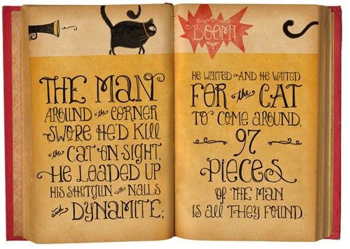
I was working making illustrations with lettering. Ale Paul from Sudtipos.com (whom I consider one of the best typographic designers) suggested that we could develop a typeface based on the morphology that I was creating for my drawings. I found it a beautiful challenge.
The reason why its name is Lady René is quite personal.
But the origin is also playful .., thinking of the character of a story that comes alive from the pages of a book in the minds of its readers. In this case, Lady René, is that character, living in the make-believe of designers and readers alike.
Is that the biggest project you’ve completed so far? Are you planning on continuing your work with your own typefaces?
I don’t know if it’s the biggest one.., but maybe is one of the most personal ones.
And of course, I would love to continue designing typefaces!
Have you turned down an assignment because you didn’t like the project? Where is the line between your artistic view and the client’s wishes?
Yes. When I work I really get involved in each project and I really try to do my best. Because of that I can’t do a lot of projects at the same time, so I choose those that I see like a challenge, or those that could be a pleasure to do.
I always try to understand the client and to contribute from my point of view. The most important thing is to establish a good communication with him/her. To know how to explain your point of view as a professional and teach (in some way) and spell out why you take one or another decision. At the same time the designer has to understand the client’s needs, background and knowledge.
Where do you find joy in teaching Typography?
I love to teach. I always say that I’ve learned more by teaching than by studying.
To see design from an analytic point of view pushes you to understand what are you doing as a professional. When it comes to typography, I like to study it as a complex reading mechanism. It’s a powerful tool for designers and we need to understand it in a sensitive way.
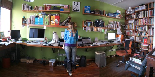
Do you have your own products/illustrations at your home?
Yes! But amongst a lot of illustrations and illustrated product by other artists! I love illustration stuff.
Do you have a favorite typeface, a letter and/or colour pattern?
A lot. It depends on what I want to say. I love to use different typefaces in each project.
Only to mention some of them: Bodoni, Caslon, Burgues Script, Univers, Dalliance, Mrs. Eaves.






5 comments so far ↓
Nobody has commented yet. Be the first!
Comment